http://www.lauraashley.com/

Laura Ashley has simple layout but nice, it has a balance of usability and has a font page for customer visits. I like this idea either, but its adverts are relevant to flash design which slows down page loading.
The navigation menu and search menu are on the same line, this idea will be applied to my design. I also like presentation of template, which has space between font ground of template and its background., makes me feel the website tidy and clear.
http://www.asda.co.uk

Asda has simple layout and nice navigation but it is inconvenient to look for a chosen sub-category. In addition, the color is matching between green and white.
 http://www.sainsburry.com
Sainsburry takes maximum size in web page and page is loading very slow.
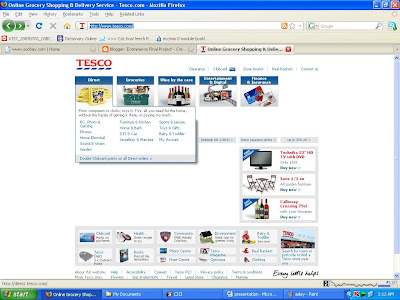
http://www.tesco.com/

Tesco give a bored layout for customer, but effective navigation which is linking to different sub-categories.
From hint collections that I have learned from the websites, I have got a initial website layout for my project.

No comments:
Post a Comment